Android theming has come a long way from the early days of the CyanogenMod Theme Engine to Substratum and now the native RRO and OMS APIs. With Android 12, Google might push Android’s theming engine to the next level thanks to the new wallpaper-based theming system code-named “monet.” When “monet” is enabled, the user’s wallpaper determines the background color and accent color throughout Settings and SystemUI, making it a true dynamic theming solution. Developers and modders, however, can’t examine the codebase of Google’s enhanced theming system just yet. This is because Android 12 is still under the “Developer Preview” stage and the software giant will only start to upload the Android 12 source code onto the Android Open Source Project (AOSP) website after the stable release.
The folks over at the DotOS project are now taking a shot at porting this feature by creating their own version of the wallpaper-based theming system inspired by Android 12. For those not familiar with DotOS, it stands for “DroidOnTime” and is a custom ROM founded by XDA Recognized Contributor mohancm on top of the AOSP base, adding in several features that make using the ROM a more pleasant experience than plain AOSP. The new theme engine is but one of these features that are scheduled for the upcoming DotOS 5.1 release.
Dubbed as “MonetWannabe,” the theming system in DotOS 5.1 allows users to choose the type of palette they want to be generated from the wallpaper and control the accuracy of the color generation process. Iacob Ionut, AKA XDA Senior Member IacobIonut-DW, who serves as the core UI/UX developer of the DotOS ROM, has coded the whole framework from scratch after carefully reversing Google’s implementation in Android 12 and tweaking the underlying algorithms for better flexibility.


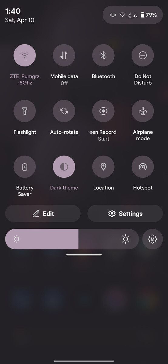

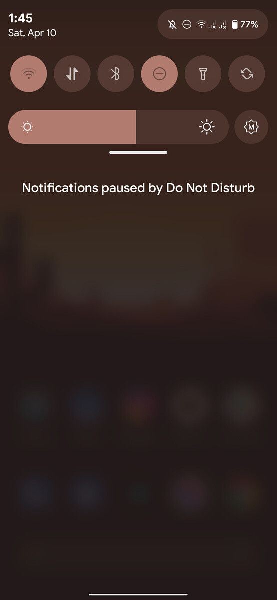

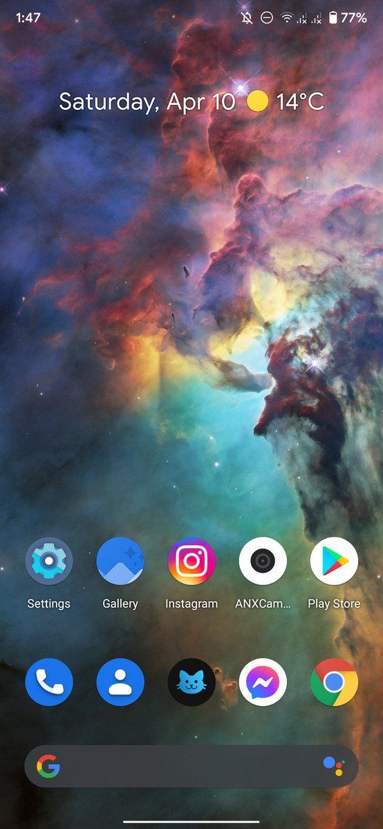


MonetWannabe in action
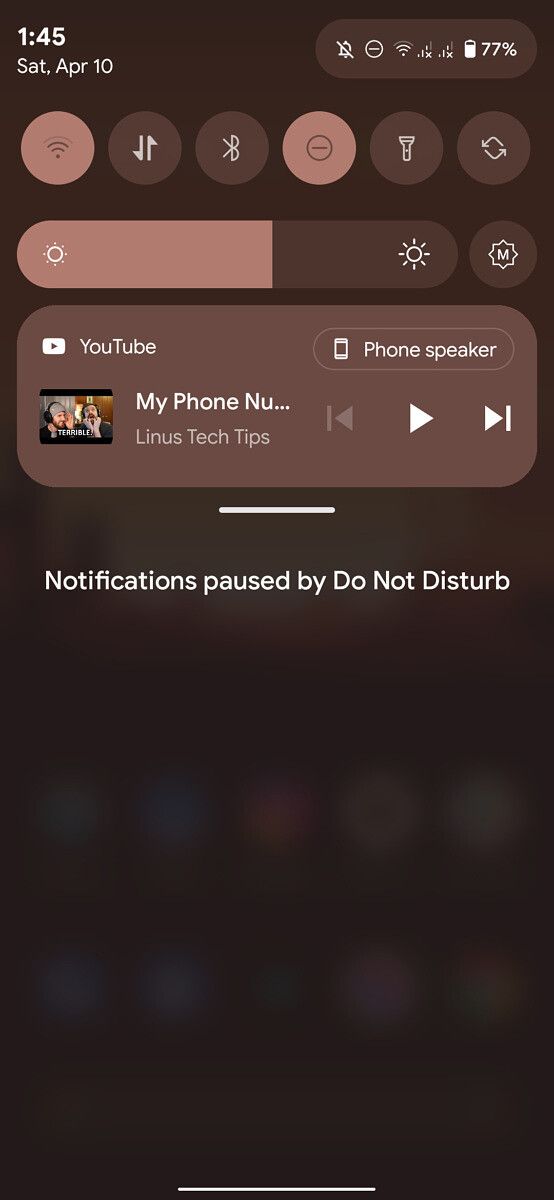
The theming engine is quite modular in nature. When enabled, it’s even possible to recolor the Quick Settings media controls (as shown below). One can simply turn off the framework and stick with manual accent coloring as well.
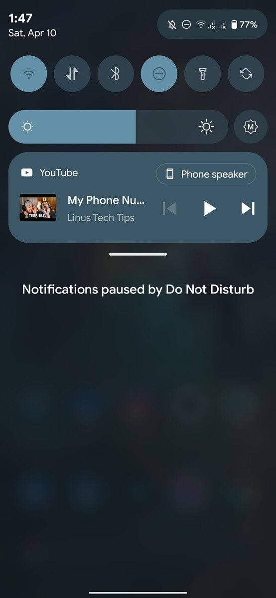
Apart from the wallpaper-based theming system, the DotOS team has also come up with a revamped Quick Settings panel UI — a portion of which is already visible in the previous screenshots. To be more precise, the UI redesign is inspired by the Android 12 early mock ups, but you can find a number of other design elements mixed in with it. First of all, the corners of the notifications and the media player are slightly rounded. The Edit and Settings buttons are similarly modified to be more accessible and match the other elements in the panel. Next comes the QS Customizer, which loses the old background and toolbar and gets a fresh coat of paint.
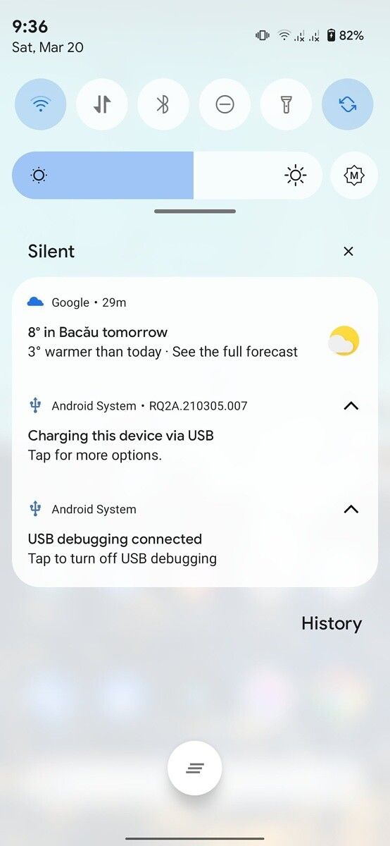
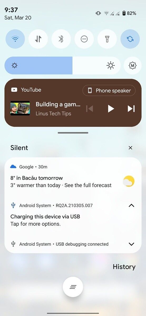
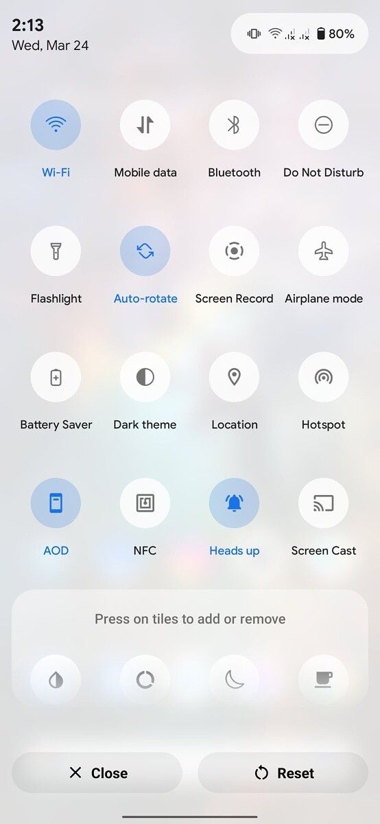
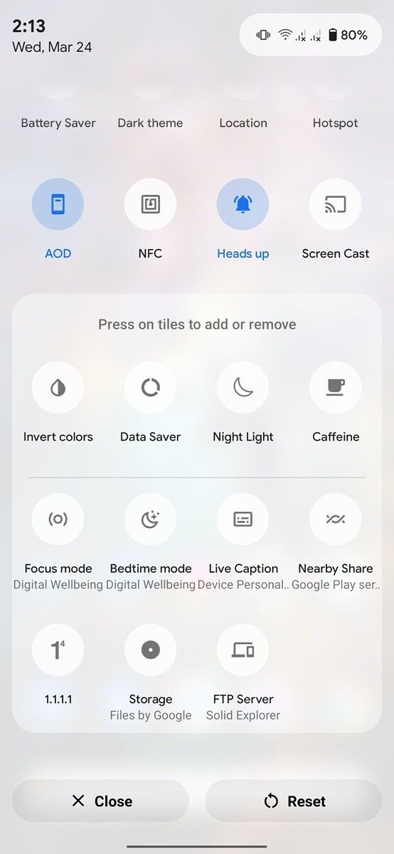


Revamped Quick Settings panel UI: Light mode vs. Dark mode
In addition, the developer has decided to redecorate the PackageInstaller module, which is a fundamental part of the Android operating system. If you think PackageInstaller is nothing but a dated-looking floating box displaying the app installation progress, then you should be surprised after taking a look at the overhauled version.

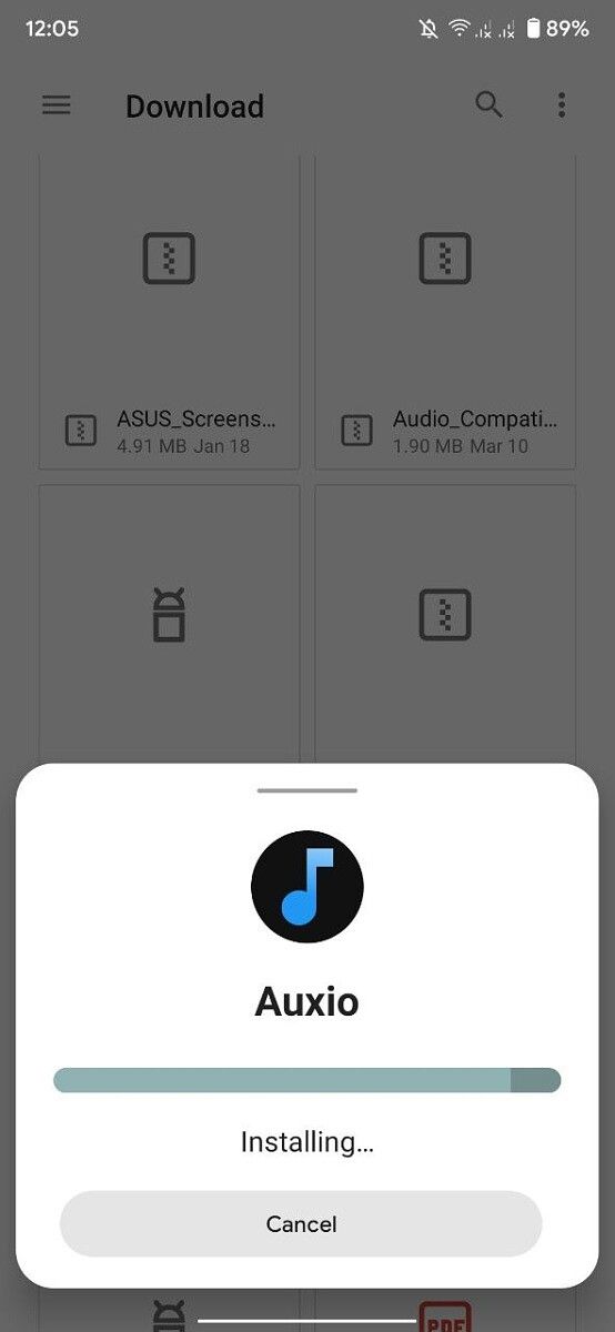
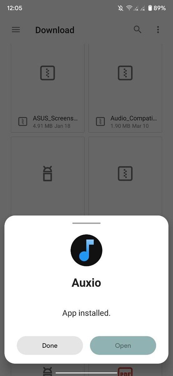
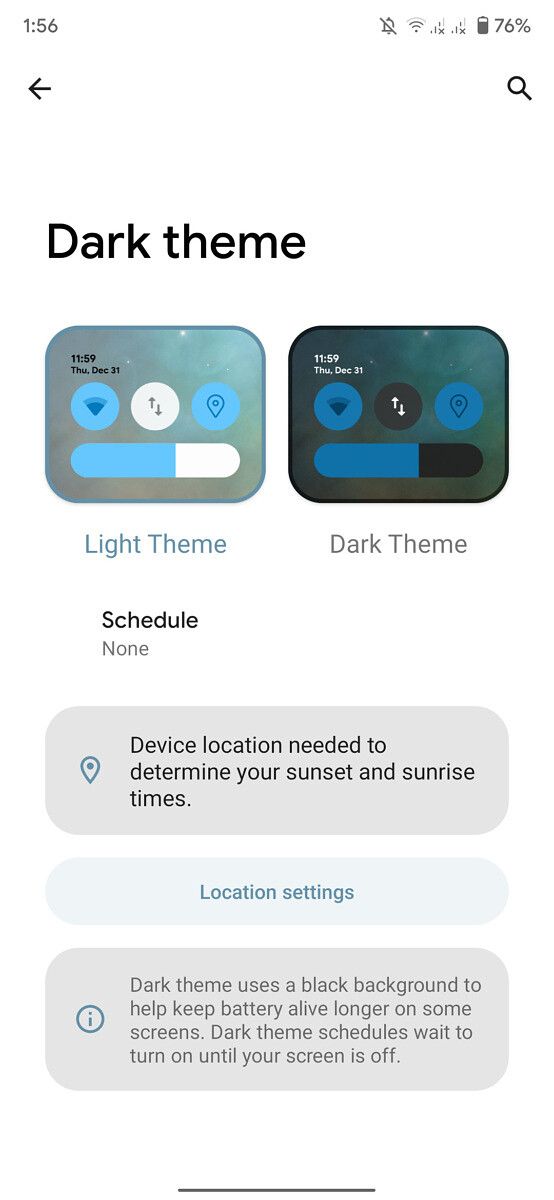
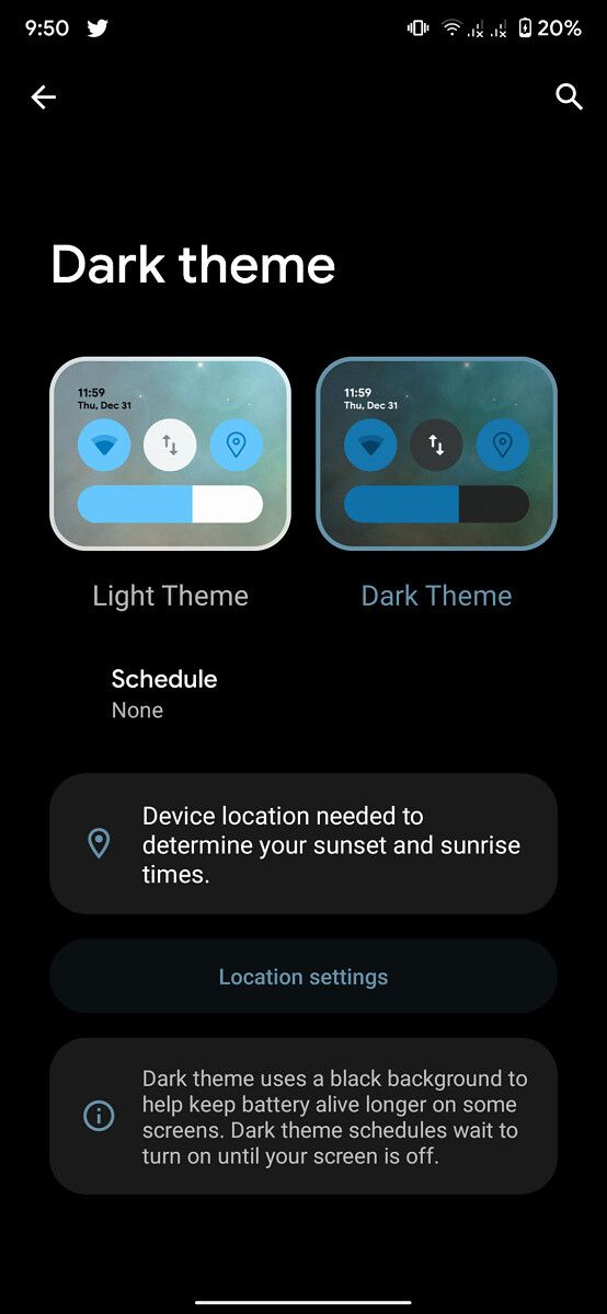
Many more UI renovations are slated for the DotOS 5.1 update. For instance, the Dark Mode settings page will be remade with consistency in mind. You can catch an early glimpse of the redesign below:
Download DotOS 5
You can download the current DotOS 5 builds for the following devices from the project’s official download portal:
- ASUS
- Lenovo
- Lenovo Z5s (jd2019)
- OnePlus
- OnePlus 3 and OnePlus 3T (oneplus3)
- OnePlus 5 (cheeseburger)
- OnePlus 5T (dumpling)
- Realme
- Xiaomi
Once DotOS 5.1 is released, we’ll let you know. You can find both the vanilla and the Gapps builds for each one of them. The latter variant already has Google apps included, so you don’t need to flash a separate ZIP file to get the Google Play Store.
If you’re interested in helping the DotOS team with development, then check out their GitHub repository. If you want to stay up-to-date on news and new releases from the team, you should consider following them on Twitter.
The post DotOS 5.1 will add a new wallpaper-based theming system and QS UI inspired by Android 12 appeared first on xda-developers.
from xda-developers https://ift.tt/3dbleYI
via IFTTT
Aucun commentaire:
Enregistrer un commentaire