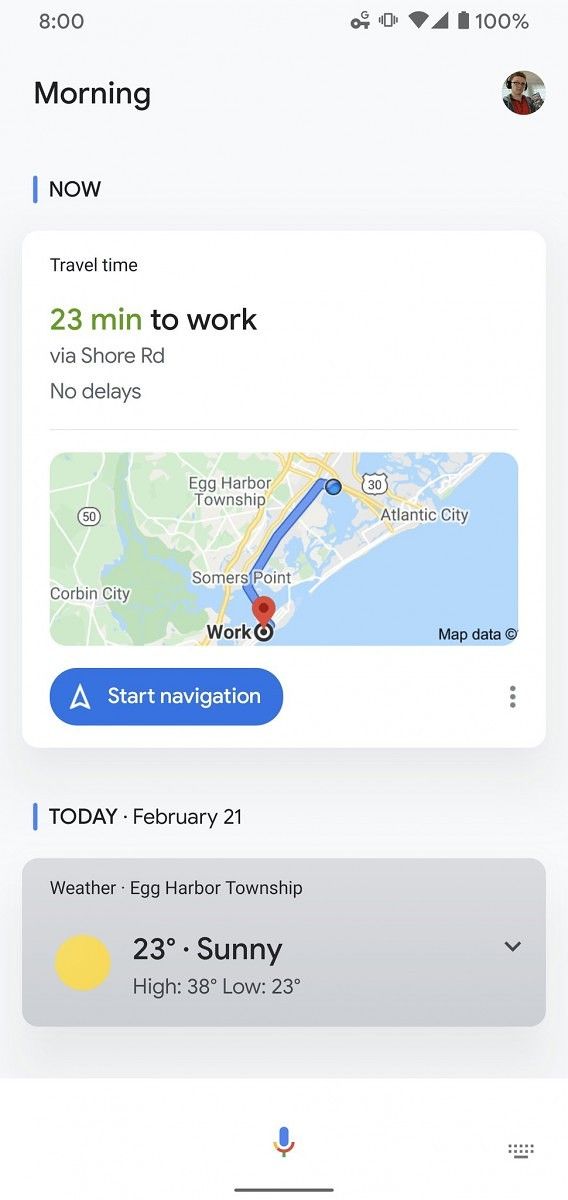
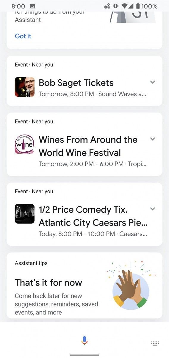
Google Assistant is the digital assistant that most people use on Android. It was released during Google I/O 2016, alongside some smart devices that can take advantage of it. So far, the Assistant has proven to be a worthy successor of Google Now. Despite the obvious superiority, there are some things that it can learn from its predecessor. For example, the “My Day” user interface, which was added in the Assistant nearly two years ago, is a resemblance to one of Google Now’s main features. It looks like the UI of this feature is getting updated and renamed to “Today.”
The update was first noticed by Max Buondonno on Twitter. He was able to access the new Google Assistant interface on the Pixel 3 and Pixel 4 XL. The updated UI looks cleaner and more up to date with Material Design standards as it introduces cards with drop shadows. Functionality wise, it doesn’t look like much has changed. The activity still displays information like weather, work commute, stocks, news, and reminders. To access the new “Today” view, all you have to do is trigger the Google Assistant and swipe up on the card.


I tried the latest stable and beta versions of the Google app on my Pixel 3 and I still can’t access the new “Today” UI, so I think it’s safe to assume that this is a server-side staged rollout. This is not the first time Google’s using this practice to test new features. There is no telling as to when this feature will be more widely available to Google Assistant users.
Source: Twitter
The post Google Assistant’s redesigned “Today” view has started rolling out appeared first on xda-developers.
from xda-developers https://ift.tt/32eyxjQ
via IFTTT
Aucun commentaire:
Enregistrer un commentaire